Overview
It is a collective transport platform that seeks to help improve mobility in Mexico City, offering transport in vans with scheduled routes and times to destinations with high traffic and where transport can be complicated for people due to the lack of mobility in the area.
With the first version of the application, it was difficult for the user to find a route and schedule that would help them with their commute. Since it relied on a map to search for a trip, the cost of the calls to the Google Maps API became too high, and it was also difficult for the driver to verify the identity of the person who was supposed to board the vehicle.
Product Designer - UX/UI
3 months
Figma, Figjam
Celestine Soubrier | Growth manager
Jorge Gajón | Dev Lead
Gabriel Arce | UX / UI
• Improve the booking process
• Make it easier to find a route
• Reduce the cost of calls to the Google Maps API
• Streamline boarding
Process
Interviews were conducted with active users to understand their frustrations and pain points when using the app, and to learn how they interacted with it and how they searched for and booked rides. Similarly, some drivers were interviewed to understand the boarding process at specific stops, in order to streamline the scheduled routes.
Users found it difficult to find a route that fit their commute to the office, experienced confusion when booking a time, and lacked certainty about the designated pick-up and drop-off points. Drivers struggled to verify passenger identity upon boarding, which disrupted the process and resulted in unexpected delays at each stop.
We conducted a 4-hour workshop spread over two days with different team members: C-level, Dev, Growth, and UX (myself) to gain a broader perspective and generate ideas from diverse viewpoints.
During the brainstorming session, participants were given 10 minutes to generate as many ideas as possible. Afterward, they were asked to group their ideas with similar ones from other participants. They were then given 5 points to vote for the ideas they considered most relevant and feasible.
Using Crazy 8s, participants were asked to create a simple booking process path, compare similar paths, and discard those deemed less viable.
Finally, a path was created, which was then used to design the interface and develop a prototype of the booking process.

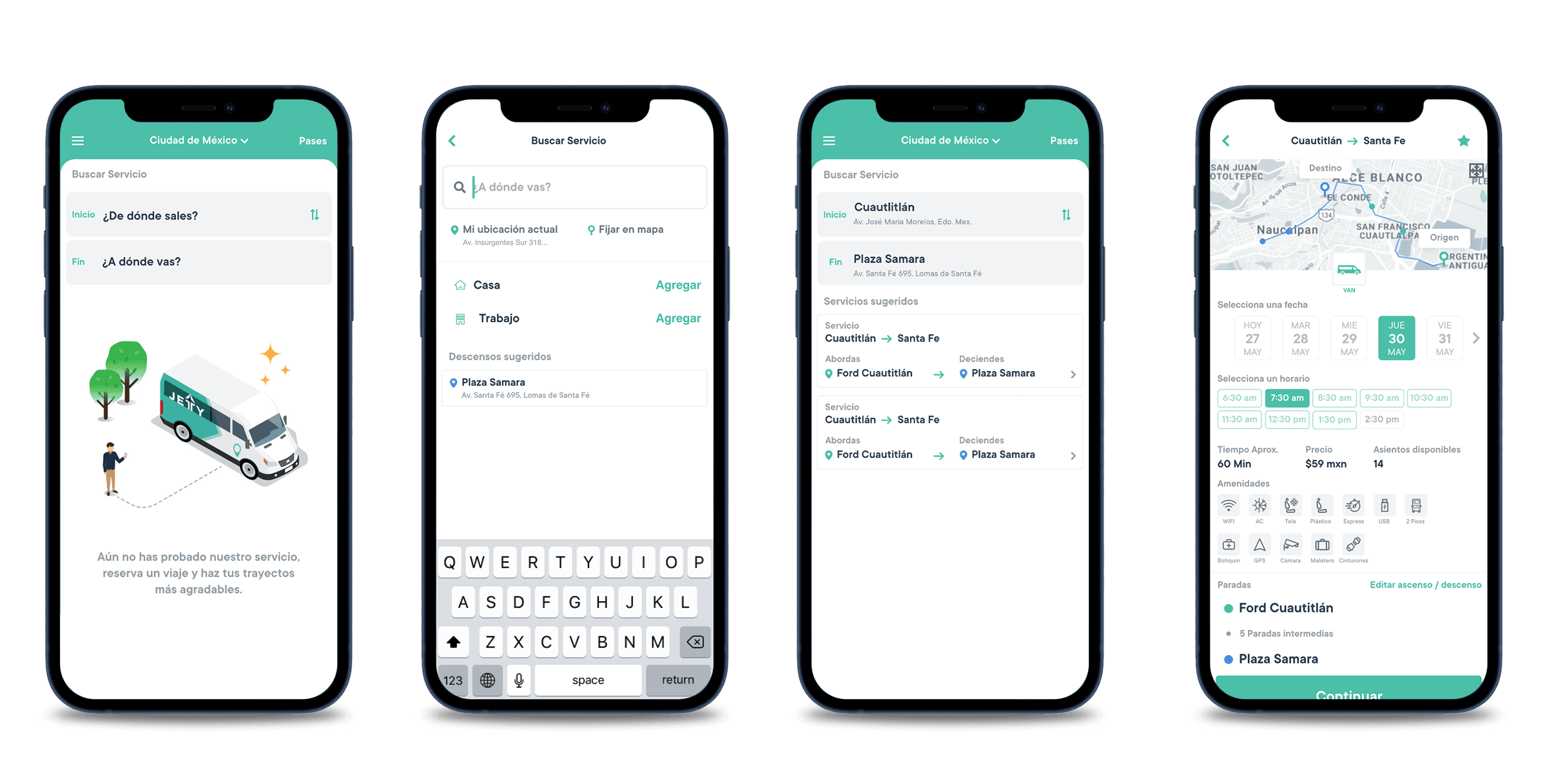
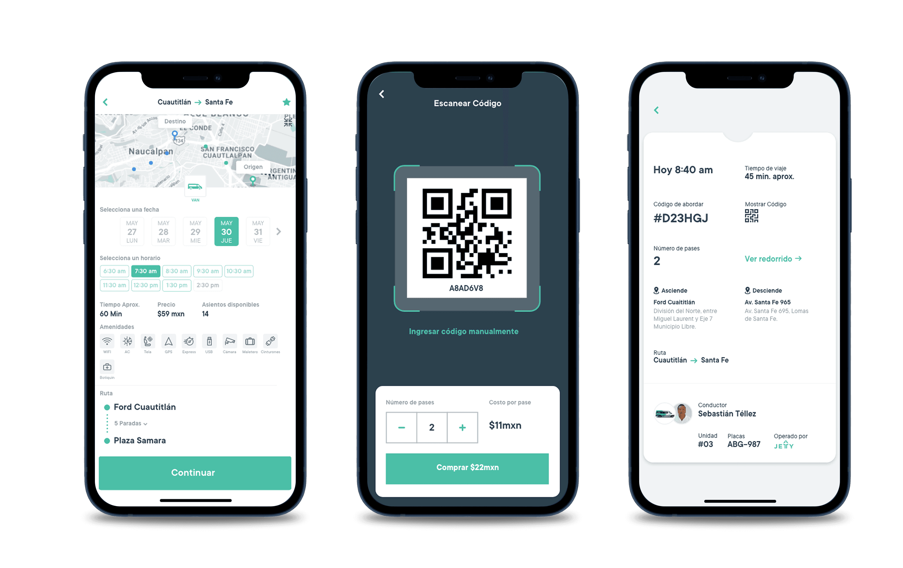
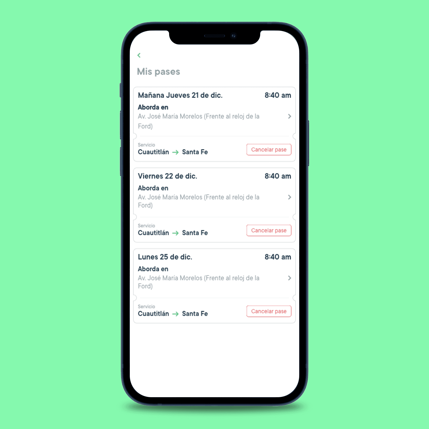
A new travel booking flow for the application was designed, based on the findings obtained in user interviews, the ideas generated in the ideation session, and the defined hypotheses.
Based on this, the flow was redesigned to simplify the steps, improve understanding of the process, and reduce friction. The goal was to create a clearer and more intuitive experience that would make it easier for users to select and schedule their trip within the app.

Wireframes
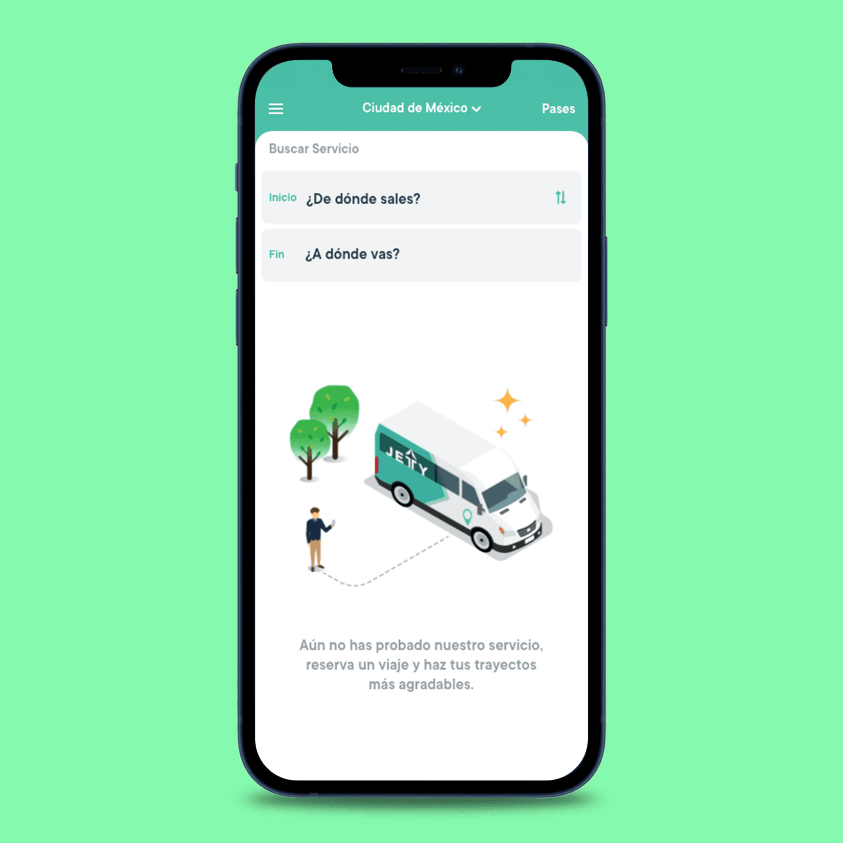
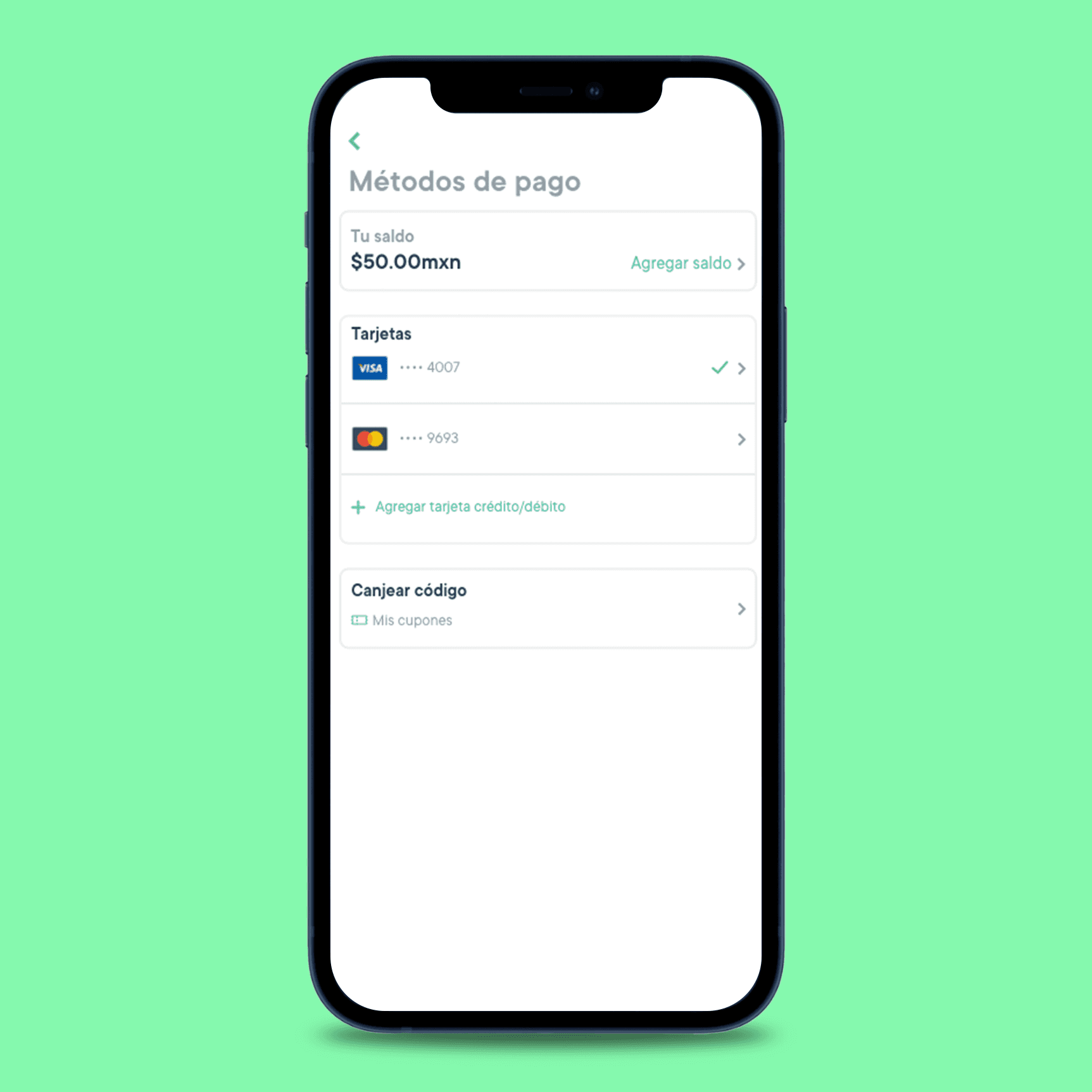
I created wireframes considering the initial hypotheses, user feedback, and ideas generated during the workshop. Based on these findings, improvements were proposed for the route search and booking process, optimizing the clarity of the flows and the interaction within the application.

A prototype of the route search flow and the pass booking process within the application was developed. Subsequently, in-person usability tests were conducted with five users, who were asked to complete two specific tasks: search for a route and book a pass.
These sessions allowed us to observe user interaction with the flow and identify opportunities for improvement in the user experience.
During the sessions, users were asked to search for a route and book a pass within the app, which allowed us to identify areas for improvement in navigation and task flow.
Achievements
40% less
than the cost of the Google Maps API
30% less
churn when searching for a route
20% less
to complete the booking process